
You know that feeling when you land on certain blogs and immediately think, “This looks professional”? It’s not always about flashy graphics or expensive themes. The difference between a blog that feels amateur and one that feels premium often comes down to the smallest details.
I’ve been obsessing over this lately. Every morning when I sit down to write before the world wakes up, I find myself analyzing what makes certain sites feel so polished. After years of running Hackspirit and studying countless successful blogs, I’ve noticed it’s the subtle choices that make all the difference.
Today, let’s dive into seven design decisions that can transform your blog from basic to brilliant. These aren’t expensive overhauls. They’re thoughtful tweaks that show you care about your reader’s experience.
Strategic white space that lets your content breathe
Ever notice how luxury brands use tons of empty space in their designs? There’s a reason for that.
White space isn’t wasted space. It’s breathing room for your reader’s eyes. When I first started blogging, I crammed everything together, thinking I needed to maximize every pixel. Big mistake. My content felt suffocating, and readers bounced faster than you could say “information overload.”
Now I’m ruthless about spacing. Between paragraphs, around images, in the margins. Give your words room to exist. Think of it like a conversation. You wouldn’t talk to someone with your face two inches from theirs, right? Same principle applies here.
Try increasing your line height to 1.6 or 1.7. Add generous padding around your text blocks. Watch how much more inviting your content becomes. It’s like the difference between shopping at a cramped discount store versus walking into a high-end boutique.
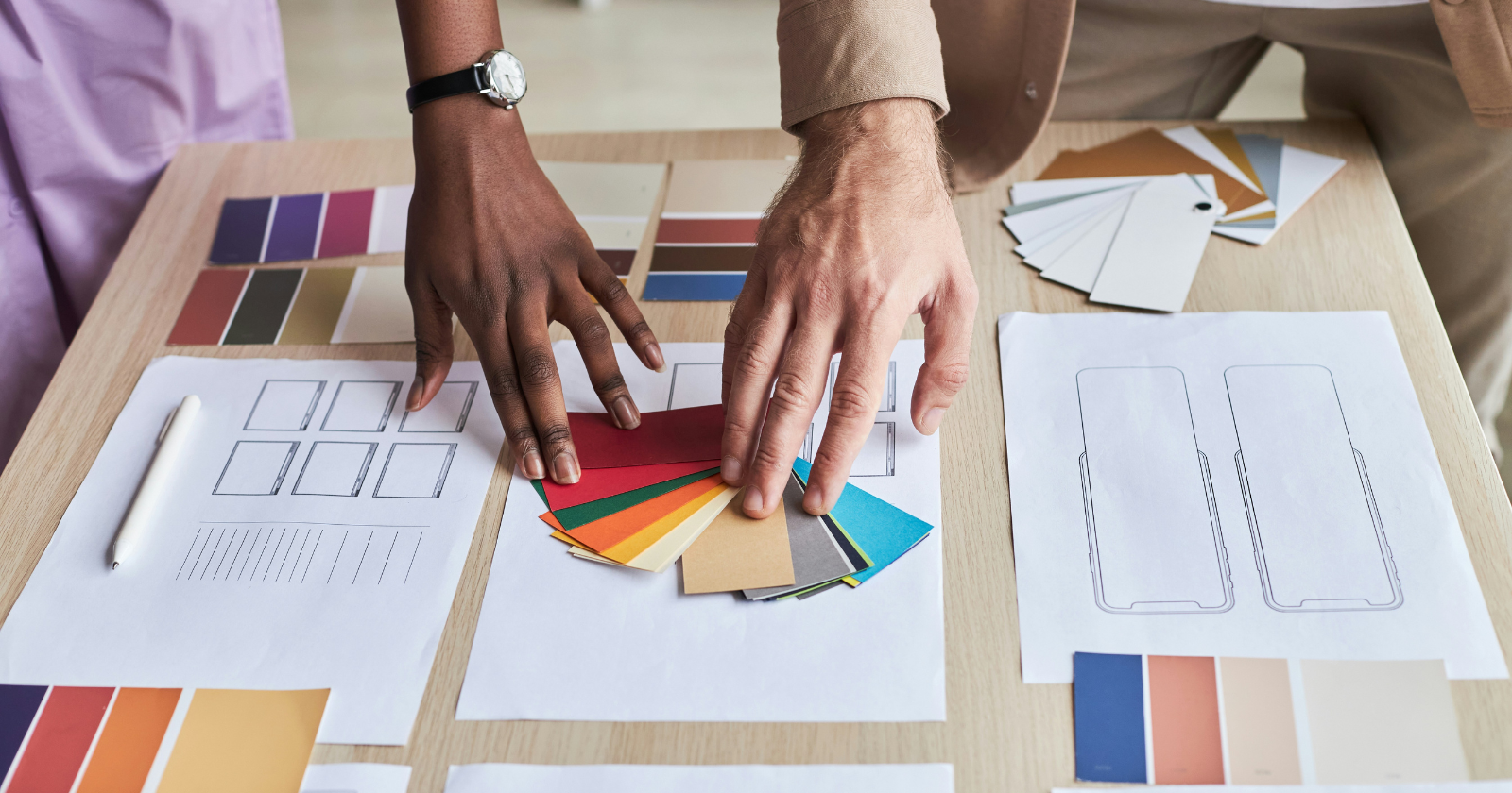
A restrained color palette that whispers sophistication
Here’s what I learned the hard way: rainbow blogs don’t scream premium. They scream amateur hour.
Pick two, maybe three colors max. One primary, one accent, and stick with them religiously. I’m talking about every button, every link, every divider. Consistency is what separates the pros from everyone else trying to figure things out.
Look at any high-end publication online. The New Yorker? Black and white with touches of red. Medium? Green accents on clean white. They’re not accidents.
When I simplified my color scheme, something magical happened. Readers started taking my content more seriously. They stayed longer. They shared more. The content hadn’t changed, but the perception had shifted completely.
Typography that commands respect without shouting
Your font choices are making statements about your brand whether you realize it or not. Comic Sans says one thing. Georgia says another.
I spent an embarrassing amount of time testing fonts last year. What I discovered? Premium blogs stick to classic, readable typefaces. They pair a clean sans-serif for headers with a serif for body text, or vice versa. But here’s the kicker: they never use more than two font families.
Size matters too. If your body text is smaller than 16px, you’re making people squint. Nobody associates squinting with premium experiences. Go for 18px or even 20px for body text. Your readers’ eyes will thank you, and they’ll unconsciously associate your blog with quality.
Intentional imagery that tells a story
Stock photos of people in suits shaking hands? Please, no. We’ve all seen them a thousand times.
Research from Frontiers in Psychology found that high design aesthetics in product images elicited positive emotional responses and were associated with higher perceived value. The same principle applies to your blog imagery.
Choose images with a consistent style. Maybe they’re all black and white. Maybe they all have a similar color grading. Maybe they’re all minimalist illustrations. The key is consistency and intention.
I’ve started using fewer but higher-quality images. One powerful image beats five mediocre ones every time. And here’s a pro tip: invest in proper image optimization. Nothing kills the premium vibe faster than images that take forever to load.
Navigation that feels effortless
You shouldn’t need a map to navigate a blog. If readers can’t find what they’re looking for in three clicks or less, you’ve lost them.
Simplify your menu. Do you really need twelve categories in your navigation bar? Probably not. I cut mine down to five essential sections, and engagement actually went up. Paradox of choice is real.
Consider adding a search bar that actually works. Make your most important content easy to find. Add related posts at the end of articles. These aren’t revolutionary ideas, but you’d be surprised how many blogs mess this up.
Custom touches that show attention to detail
Generic social sharing buttons? Default comment forms? These scream template.

Small customizations make a huge difference. Design custom dividers between sections. Create unique bullet points that match your brand. Style your blockquotes to stand out. These tiny details add up to create an experience that feels intentional, not accidental.
In my book “Hidden Secrets of Buddhism: How To Live With Maximum Impact and Minimum Ego”, I talk about how small, mindful choices compound over time. The same principle applies to design. Each small improvement builds on the last.
Loading speed that respects your reader’s time
Nothing says “amateur” like a blog that takes ten seconds to load. Speed is a design choice, even if it’s invisible.
I learned this lesson when I realized readers were bouncing before my content even loaded. All those beautiful design choices meant nothing if nobody stuck around to see them.
Compress your images. Minimize your plugins. Choose quality hosting. Use a content delivery network if you’re getting international traffic. These backend decisions directly impact how premium your blog feels.
Think about it: when was the last time you waited more than three seconds for a page to load? Exactly. Your readers won’t either.
Final words
Creating a premium-feeling blog isn’t about spending thousands on custom design. It’s about making thoughtful, intentional choices that show you value your reader’s experience.
Start with one change. Maybe it’s adding more white space. Maybe it’s simplifying your color palette. Pick one thing and implement it this week.
Remember, every design choice is a message to your readers about who you are and how much you care about their experience. Make those messages count.
The best part? These changes compound. Each improvement makes the next one more impactful. Before you know it, you’ll have transformed your blog from forgettable to unforgettable, one subtle choice at a time.


