
Editor’s note (March 2026): This article is part of Blog Herald’s editorial archive. Originally published in the early 2010s, it has been reviewed and updated to ensure accuracy and relevance for today’s readers.
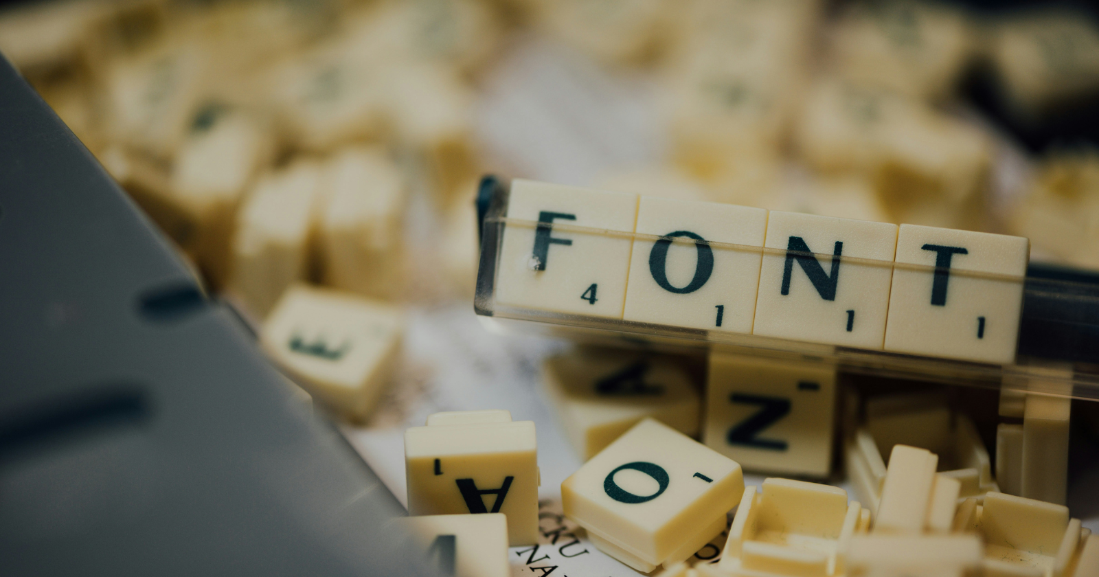
Most bloggers and content creators spend hours crafting the perfect post — then apply a default font without a second thought. That’s a missed opportunity. Typography isn’t just a design concern. It’s a communication decision. The font you choose shapes how your message is received before a single word is read.
When the original version of this article was published, font selection was largely a conversation about print readability and document formality. Today, the stakes have shifted. Bloggers are producing editorial packages — posts paired with downloadable resources, lead magnets, media kits, press materials, and branded documents. The fonts you choose in Microsoft Word carry weight across all of it.
Here’s a look at the fonts that have stood the test of time, what the current typography landscape tells us, and how to make smarter decisions about type in your content workflow.
The classics that still hold up
Some fonts earn their reputation over decades of use — and a few of the originals remain relevant precisely because of that longevity.
Calibri became Microsoft Office’s default font in 2007 and held that position until 2022, when Microsoft replaced it with Aptos. That’s fifteen years as the industry standard — a remarkable run. It remains a strong choice for clean, modern documents. Its rounded geometry communicates approachability without sacrificing professionalism.
Garamond traces its origins to 17th-century France and continues to appear in editorial and publishing contexts because it projects refinement and authority. For bloggers producing e-books, white papers, or long-form content in document form, Garamond brings a credibility that sans-serif fonts often can’t match.
Times New Roman has a more complicated reputation. It was the default font for Word for years, and many readers still associate it with academic rigour and journalism. It remains a dependable choice when formality is required — though it can read as dated in contexts where freshness matters.
Helvetica is arguably the most successful typeface in history. Its neutrality is its superpower: it signals competence without inserting personality. Widely used in branding, signage, and publishing, it continues to be a go-to for content creators who want their words — not their typography — to do the talking.
Verdana was specifically designed for screen legibility, with wide letter spacing and open forms that perform well at small sizes. For bloggers producing documents intended for on-screen consumption — think digital guides, workbooks, or downloadable checklists — it remains one of the most practical choices available.
Georgia, designed by Matthew Carter in 1993, was built for the web long before most fonts were. It renders cleanly at varying resolutions and carries an editorial quality that suits long-form digital reading. It’s a natural fit for bloggers who want a serif option that feels contemporary rather than archaic.
What’s changed in the typography landscape
Typography has evolved considerably since this list was first published. A few developments are worth understanding.
Variable fonts have quietly changed what’s possible. Unlike traditional fonts — which require separate files for each weight and width — variable fonts allow fine-tuned adjustments across a continuous axis. According to Fontfabric’s 2025 typography trends report, variable fonts now adapt responsively to different screen sizes and can interact dynamically with scrolling and other user behaviors. For most bloggers producing documents in Word, this is a future-facing feature rather than an immediate practical concern — but it signals where type design is heading.
Serif fonts are back. For years, sans-serif dominated digital design, read as clean and modern while serifs carried an old-fashioned association. That narrative has shifted. TypeType’s 2025 trend analysis notes that modern serif typefaces are now positioned as bold and distinctive rather than traditional — with designers using them to signal authority and depth in a landscape saturated with generic sans-serif choices.
Microsoft replaced Calibri as the default. In 2022, Microsoft introduced Aptos as its new default font across Microsoft 365 applications, phasing out Calibri after fifteen years. Aptos is a humanist sans-serif with wider letterforms and improved readability at small sizes. If you’re working across Microsoft 365 documents, this is the new baseline.
Choosing the right font for the job
The mistake most content creators make is treating font selection as a single decision. In practice, it’s context-dependent. Different document types call for different approaches.
For brand documents and media kits, consistency and distinctiveness matter. Pairing a clean serif for headings with a neutral sans-serif for body text creates visual hierarchy while projecting professionalism. Garamond headlines with Calibri or Arial body text is a combination that holds up across contexts.
For downloadable resources and worksheets, readability at small sizes is the priority. Verdana and Georgia are reliable choices — both designed with screen legibility in mind, both widely available, both tested across decades of digital use.
For proposals and business documents, formality signals credibility. Times New Roman remains serviceable, but Georgia or Garamond project similar authority with better screen rendering. Calibri works well when a lighter, more conversational register is appropriate.

For blog-adjacent materials — newsletter templates, editorial guides, content calendars — there’s more room to experiment. The typography doesn’t need to be conservative; it needs to be on-brand and legible. That’s a different standard, and it opens the door to more expressive choices.
Pitfalls worth avoiding
A few common mistakes show up repeatedly in the documents bloggers produce.
Using too many fonts. Two complementary typefaces are generally the maximum a document can sustain without looking cluttered. More than that signals a lack of editorial control rather than creativity.
Confusing novelty with brand fit. Trendy fonts are worth knowing about, but they’re rarely appropriate for content creators building long-term authority. A font that looks current in 2025 may look dated by 2027. The classics earn their status precisely because they don’t follow short cycles.
Neglecting hierarchy. Size, weight, and spacing are tools for guiding the reader’s attention. A document where body text and headers feel visually similar forces readers to work harder to parse structure. That friction shows up as disengagement.
Downloading fonts from unreliable sources. Google Fonts remains the most accessible library of high-quality, licensed typefaces. If you’re supplementing Word’s built-in options, start there.
The case for taking type seriously
Typography rarely gets discussed in conversations about content strategy — and that’s a gap worth closing. The fonts you choose in your documents and downloadable assets are part of your brand expression, whether you’ve thought about them deliberately or not.
The original list that anchored this piece identified fourteen solid options, most of which remain useful today. The additions worth noting are Aptos, now the Microsoft default, and Georgia, which continues to outperform most of its peers for screen-based editorial reading.
But the deeper point is this: typography is a form of editorial judgment. When you choose a font carelessly, you’re making a decision anyway — just not a considered one. In a content landscape where attention is scarce and first impressions carry disproportionate weight, that’s a choice worth making deliberately.


