Is Melody Mimicking WordPress?
Melody, Movable Type’s cousin (and perhaps frenemy) is in the process of redesigning their user interface before their immanent 1.0 launch.
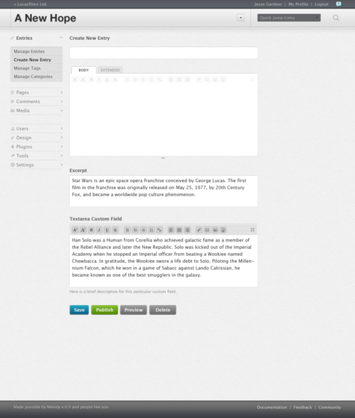
While the upcoming CMS is proposing a few odd changes to their future layout (i.e. putting the logo at the bottom of the admin page), the proposed layout seems eerily similar to WordPress.
Developers working on Melody are claiming that the layout is borrowed from Movable Type 3 instead of WordPress (which could be true as I’ve never tried MT3), although truth be told it does look much nicer than Movable Type 4 (as well as Typepad).
Open Melody is also planning on integrating another feature used by WordPress (that would be WP.com) that might raise concerns as to whether Melody is mimicking the best of WordPress.
One of the debates we often have as a community is what Melody should look like. Inspired by that debate Jesse Gardner took a stab at some concepts for Melody that are exciting to see. […]
Some additional concepts we are talking about:
Being able to tack your favorite blogs into the menu so that they are always immediately accessible.
Using the same window for personalized navigation shortcuts. (Official Melody Blog)
Note: Emphasis mine.
Although popularized by Tumblr, truth be told many popular platforms (including Blogger) allow one to “follow” blogs in order to receive updates from friends without having to load an RSS reader or subscribe via email.
While there is nothing wrong with Melody adopting a clean layout as well as following blogs from within ones dashboard, hopefully the team will consider something more innovative to help differentiate itself from WordPress (as well as Movable Type).
Darnell Clayton is a geek who discovered blogging long before he heard of the word "blog" (he called them "web journals" then). When he is not tweeting, friendfeeding, or blogging about space, he enjoys running, reading and describing himself in third person.


