Busting Blog Ad Clutter
I recently ran across a brilliant article that might help us all improve our blogging and blogging experience. The title was titillating and I knew it would solve my problems, but it took a while to find the blog content. When I did, I had to weigh a very important decision.
Is the content in the article worth the advertising assault on the eyes?
I wanted to write about the article. I wanted to promote it to my readers to let them know I’d found a worthy treasure. I wanted them to take time from their busy schedule to seek out this treasure and learn and grow from digesting the wisdom in the article. Yet…
My eyes hurt scanning the page looking for the words of wisdom I knew would be there. I had to poke and scroll around looking for the magic words. Finally I found them, under 6 rows (and 8 ads) between the header and the content.
You would think that I would be doing my famous dance of joy to have finally uncovered the magic treasure of lessons and wisdom. I was, until I encountered my first ad after the first paragraph.
Paragraphs were separated by huge chunks of empty whitespace with ugly text ads barely related to the information I sought. Within the words of the paragraphs were links with double underlines, highlighted in ugly green colors, which produced pop up AJAX ads when my mouse accidentally moved over them. On other links, web preview pages popped up, covering what I was trying so eager to read through all the advertising.
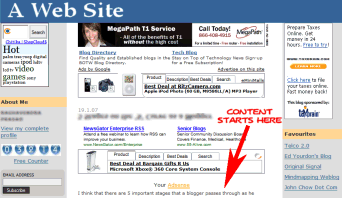 It was a three column layout and the two sidebars were stuffed with tons of ads and links (censored version show here). I couldn’t find any navigation that led to more or related content within the site itself. It did feature a very long blogroll, which indicated to me that they were more concerned about linking to off-site blogs rather than to themselves. I finally gave up on my hunt for navigation links. They might have been there, but I couldn’t find it through the clutter.
There were text ads, picture ads, mall ads, free visitor counter ads, tabbed ads, AJAX ads, revolving ads, blinking ads, all sorts of advertising stuffed into every corner. I was nervous about hovering over any link for fear it would trigger a pop up another web page preview or ad.
According to a recent article in the New York Times, “Anywhere the Eye Can See, It’s Likely to See an Ad”, we are assaulted with advertising literally everywhere we look.
Add this to the endangered list: blank spaces.
Advertisers seem determined to fill every last one of them. Supermarket eggs have been stamped with the names of CBS television shows. Subway turnstiles bear messages from Geico auto insurance. Chinese food cartons promote Continental Airways. US Airways is selling ads on motion sickness bags. And the trays used in airport security lines have been hawking Rolodexes.
Marketers used to try their hardest to reach people at home, when they were watching TV or reading newspapers or magazines. But consumers’ viewing and reading habits are so scattershot now that many advertisers say the best way to reach time-pressed consumers is to try to catch their eye at literally every turn.
For me, instead of convincing me to buy, I’m faced with a bigger decision.
Whether or not the content superseded the horrid assault of advertising.
It didn’t.
The look, layout, and content of your blog influences our judgment as to the quality of the content, or so sayeth the promoters of web page preview links.

Okay, so we’re not past surface judgments yet. I’ve found brilliant content on ugly web pages, so I’m generally unbiased recommending such articles. This, however, was more eye junk than necessary.
These are some of the assumptions and questions I made as part of my decision-making process on whether to link or not link:
- Doesn’t this blogger have any self respect for whitespace and cleanliness? Is their life as cluttered as their blog?
- The feel of the page is that it is out-of-date and old fashioned, thus the information on the page must also be old.
- The clutter makes the article difficult to read and look at. Why should I assault my readers with a recommendation for hard-to-read articles?
- Does this site I’m about to highly recommend really complement my own site and quality standards?
- Doesn’t this blogger stay up-to-date on web fashions as well as trends? Overkill on ads is very out-of-date.
- The content is most likely not be original to the blog. It’s probably a purchased or scrapped article.
- This blogger spends more time chasing advertising and traffic link baits than really producing quality content and information.
- They are more into making money than sharing knowledge and information.
The issue is not about whether or not the blogger has the right to include ads or generate income from their blogs. The issue is when is too much too much?
My question to you is:
What do you think about a blog with too many ads?
Does the amount and type of advertising on a blog influence your opinion of the content? Would you recommend blogs and articles with such over-kill on advertising to your readers? Do you even think about how the site looks before you recommend it?
Lorelle VanFossen blogs about blogging and WordPress on Lorelle on WordPress, and is a long time support volunteer for WordPress. Lorelle travels too much and reports from life on the road in Taking Your Camera on the Road and covers family history and genealogy on Lorelle’s Family History, and writes for too many blogs, ezines, and magazines.
I’m with you, nothing turns me off more than a site cluttered with ads. Especially if it’s a site that isn’t well established or that I haven’t visited before. It leads me to think the owner doesn’t care about user experience. If they just want to make money, they probably don’t put much effort into content, and the feeling is uncomfortable. A lot of small sites hurt themselves in this area.
Granted, this one seems to be a little over the edge .. having 2 chitika eMiniMalls and such .. but I can name you 5 top digital camera or photography blogs that look the same – either with the content like this one (pushed down below the fold) or wide ads inside the past that push thin reading columns to the side using the align=right or something like that.
Personally, I get a little more peeved at sites who embed stuff like affiliate or clickbank products BEFORE the loop and posts (like above) but, then use those TinyURLs or clickbank references that when you mouseover you can’t tell where the heck you could go if you linked to them. I would much rather see the 100 character URL pop up in my bottom taskbar as I float over a link, than a made-up one.
I think if you found a site with good content, and did not pass it along to your readers BECAUSE OF ITS LOOKS .. well .. what does that make us? Special? You can’t judge a book by its cover (you can, but shouldn’t) .. and maybe if you (anybody in general) started passing along links to these sites – maybe traffic and new visitors will make them realize eventually that they do have something important to say or is useful to society – and the readers can either say something or not say something.
What would I do? I wouldn’t have changed the screen image. I would post the URL and then send an email to this person .. “Look! We don’t like that!” .. Instead, he’ll just see less traffic, and spend more money trying to build up traffic and not getting quality traffic, he’ll have to keep up with the ads on the space to pay for it.
PS.. nice to see you here Lorelle .. I’m a long-time reader and fan, but not a stalker :D
HART, it’s very easy to find out which site that is, as searching for the only line of content visible in the doctored image above only brings up one site! :)
I am personally against all types of blog and website advertisements. Its only purpose is to use visitors to earn money. I am against it even if it is used to pay for hosting. Bottom line, if you can’t afford a paid host, don’t use a paid host. Ads make website ugly and it doesn’t really make anyone intelligent click on them. If you receive a lot of clicks, you can safely conclude that only unintelligent people are visiting your blog, and that is not really what you want, now is it?
Blogs should be used for personal development or to spread your message to the world. One should blog for oneself, not for the sake of others. If not, it will be increasingly stiff and boring, resulting in a bad blog with ads that no one clicks and now, no one even visits the blog.
Save the blogosphere, do not use paid advertisements!
Oh my God!
“I am personally against all types of blog and website advertisements.”
Then you will no doubt to boycotting all the sites that use them? Gonna be a very quiet Internet
“Its only purpose is to use visitors to earn money.”
Is that like TV advertisements only using viewers to earn money?
“Bottom line, if you can’t afford a paid host, don’t use a paid host.”
You get what you pay for. Large sites wouldn’t survive on free hosts. Also, many free hosts impose their own adverts!
Ads make website ugly and it doesn’t really make anyone intelligent click on them.
Some advertisements work. They must do, otherwise people wouldn’t advertise. It’s incredibly insulting to everyone to say that people who click on ads are unintelligent. What’s unintelligent about seeing an advert for a product or service related to the content you are reading, and clicking on it?
“If you receive a lot of clicks, you can safely conclude that only unintelligent people are visiting your blog,”
I think not.
By the way, I see you are providing free advertising for a flower delivery service on your blog.
I may have fallen into a troll trap, but comments like this make me very angry. Why is it somehow OK to earn money in traditional publishing and media, and yet there’s this backlash against anyone who dares to earn money from blogging.
My livelihood comes from blogging, Moridin. If the ads on the sites I write for or own ceased, I’d lose my income. Sure, if I had a couple of million pounds sat in the bank, I’d blog for free, because I love it. I also have to support my family. Your attitude has made me quite cross.
Hmmm. I count six banner ads on this page. And, 19 text links to dating services and such. One of the banners ads is in the middle of content. Did I miss any? I am having a good laugh!
Yes, Robert, the Blog Herald has a fair few ads, but they’re not so intrusive that you have to scroll to get to the first piece of content. Your site also has quite a few ads, but I could still find the content. No doubt Moridin would say you should pay for the site yourself and do it all free of charge, but you, like many of us who provide significant content on the web, do seek some remuneration for our trouble.
But should that be the main reason for blogging? To gain money? No one can honestly say that they click a lot of blog advertisements because they are honestly interested in the products they offer.
Andy Merrett, no I do not boycott websites with advertisement, I simply do not click on any, because I despise it. Yes, the same idea goes for TV channels. The only reason TV has advertisements is so that they can gain money and have a profit. There is also a thing called hosting your website yourself if it is to large or whatever for a free host. Also, most paid hosting does not cost that much and certainly doesn’t require advertisement to cover.
I have nothing against earning money from blogging in the sense of getting paid for the content that you produce solely for the fact that you are producing content as a sort of wage for it. I do however, oppose to using advertisements for the sole purpose of gaining money,
Advertisements rarely give a large gain and most of the time, it makes the website less attractive. Advertisements is intrusive just because they exist.
How about getting a real (as in real life offline) job and use blogging as a.. hobby if you will?
As a side not, the link to Flowery delivery service is not an advertisement, it is a request by the author of the theme in exchange for using it and is a result, part of the copyright and not advertisement.
What would you rather have; money for the premium content you provide or money for clicks on advertisements, which isn’t necessarily related to the quality of your content? I know what I prefer.
“How about getting a real (as in real life offline) job and use blogging as a.. hobby if you will?”
I have had a ‘real’ job for 14 years, but then the opportunity arose to change my job to writing full time. I actually rarely call myself a ‘problogger’ – I’m a freelance writer.
Some of the money I ‘earn’ comes directly from advertising. Some of it is paid to me by other companies but they themselves make money from advertising. What is so wrong with that.
Of course commercial TV companies use advertising to make money, as do newspapers and print magazines. It’s how they raise the revenue to make programmes. Non-commercial stations are either run on the generosity (and richness) of the owners, or they’re a national concern (like the BBC) and are paid for by collecting a license fee from each member of the population who uses (or could potentially) use their service.
As I said, my main motivation for writing is not the money, but as I spend 10-12 hours per weekday doing it, why shouldn’t I treat it as my real job?
I host my own websites, and did host them when I was running them part-time whilst having a ‘real’ job.
“Also, most paid hosting does not cost that much and certainly doesn’t require advertisement to cover.”
Maybe not for small websites, but why don’t you ask a few people in the technorati top 100 who have professional paid hosting, how much their bandwidth bills are? Or ask ‘real’ websites (ie not blogs) what their hosting costs are. Significant enough to need to seek a financial return.
“Advertisements rarely give a large gain”
Sorry to name drop, but maybe you should take to the likes of Darren Rowse (sorry Darren, your example is the most obvious) who make significant money from AdSense, Text Link Ads, etc. I don’t think anyone would have paid him what he earns now to write for their blog.
I think we’re going to disagree on this, but I can almost guarantee that I wouldn’t get paid for my Shiny Media or Blog Herald work if they didn’t run, and make money from, ads.
The information these sites provide is still free to the reader. That’s how it’s done. I don’t think any of us really like ads that much, but they are currently a necessary part of our media landscape – any media.
Don’t forget that the point of this article wasn’t whether or not a blog should have ads. It’s about how those ads are used. When the ads get in the way of access to content, when the ads overwhelm the content to the point the reader things “ads” and not “information I can use”, there’s something wrong with the balance of things on the blog.
Today’s blog ads are ugly. They typically don’t fit within the design and are stuck in the top or middle of posts forcing the user to scroll around them, or fake them out for clicking, making them think they are part of the post.
Ads aren’t “bad”, though they are often used badly.