7 Tweaks to Amplify Your Landing Page’s Conversion Rate
A landing page is a vital element to have on your blog or website. Its job is to help you convert your readers to leads and, eventually, customers.
Setting up a landing page is the easy part. Getting this to have a high conversion rate…that’s a different story altogether.
The overwhelming amount of online content published every day, combined with the ever-changing ways how customers decide what to buy, has made getting the right traffic to visit your blog more challenging.
Add to that is the reality that only 1-3% of your site’s traffic will convert into leads and customers.
So, rather than hustling to get more content published and promoting them like there’s no tomorrow, what you should be focusing on is improving your landing page’s conversion rate.
Why is it important to prioritize conversion rate optimization?
Having a 1% landing page conversion rate may look pathetic, at first…
…until you shift your perspective.
The fact that you got this 1% is that people are visiting your blog and are liking what you see.
What conversion rate optimization does is to get more of these people already visiting your site to do what you want them to.
That’s why brands that practice conversion rate optimization makes more money and cut back their cost per acquisition costs by half.
The best part?
Conversion rate optimization is a fairly new strategy, so not very many bloggers—even marketers—are using this.
That said, here are seven ways how to amplify your landing page’s conversion rates to grow your email list and generate more income through your blog.
1. Craft a compelling Call-to-Action button
Your Call-to-Action (CTA) button is the most critical part of your landing page because it’s what’s going to give your visitors a reason to take action.
When writing your CTA button’s message, don’t just tell your visitors what to do. Tell them what they’re going to get. Not only will this make your CTA button more specific, but it’ll also give them the gist of the copy of your landing page.
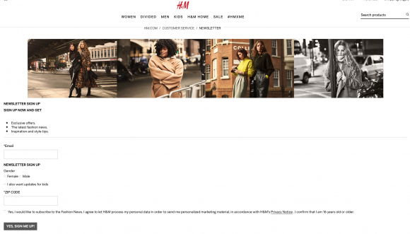
The length of your CTA button’s message also matters. Jeff Bulas recommends to use between two and five words in your CTA button like what H&M uses in their newsletters:
Also, steer clear from using any jargon in your CTA button. They may make you look smart, but if your visitors can’t understand them, they won’t click.
The CTA button’s design also matters. The color should make it stand out enough to quickly catch your visitor’s attention, but subtle enough so that it doesn’t distract them from reading your copy.
At the same time, you’d want your CTA button to be large so that it’s easy for your visitors to click whether they’re viewing your landing page on their laptop or smartphone.
2. Use text CTAs within your blog post
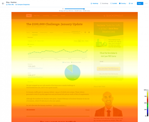
Your visitors have grown so accustomed to seeing image banners that they’ve now started skipping any image offering something, even if it’s a free offer. Nielsen Group calls this “banner blindness,” and it’s apparent in the heatmap results of this web page:
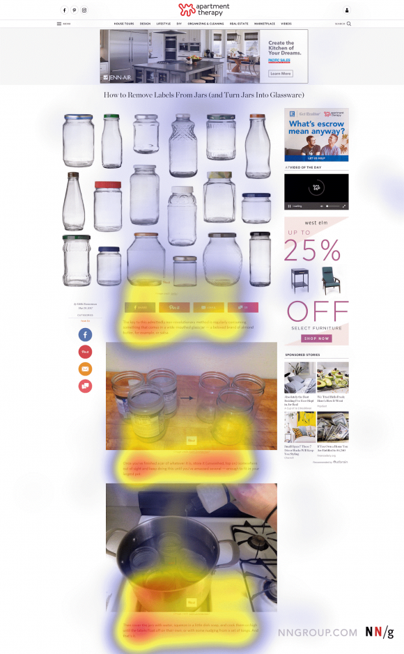
Now that doesn’t mean you should ditch using these banners altogether because they can still convert a few of your visitors.
However, if you want to get more visitors to convert, sprinkle text CTA links within your blog post.
This has been the strategy HubSpot has been using ever since they discovered that 93% of their blog readers click on text CTA links while only 6% clicked on the CTA banner.
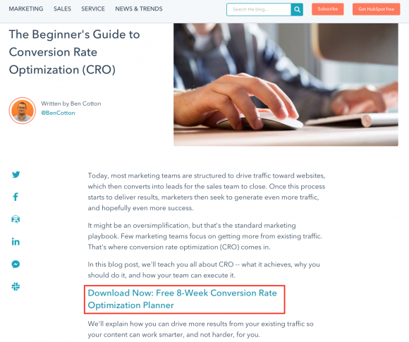
The reason why this works is that text CTA links blend more seamlessly with the rest of your blog post because it looks like another subheading, making it less likely for your readers to skip it.
Tools like Hotjar and Crazy Egg have a scroll map feature that’ll show you which sections of your blog posts do your readers stop scrolling and start reading.
These are the prime areas where to include your text CTA links.
3. Improve your landing page’s loading speed
Ideally, your landing page should take no longer than 3 seconds to load. Any longer than this and your visitors will leave.
Google’s PageSpeed Insights tool can help you see how fast your landing page is loading. It’ll also give you a list of issues within your landing page and, more importantly, suggestions on how to fix these to boost your landing page’s loading speed.
4. Use landing page templates that are functional and visually appealing
Have you ever gotten turned off by a landing page, but can’t seem to put the finger on what exactly made you feel that way?
Chances are, it’s got something to do with the landing page’s design.
That’s because your landing page’s design subconsciously affects your visitor’s decision-making process.
And that’s the reason why your landing page isn’t converting as many visitors as you’d like, despite having all a spectacular copy and all the critical elements in place.
You don’t have to be an expert graphic designer or web developer to have a visually appealing landing page. You can find lots of free landing page templates that you can use.
When designing the layout of your landing page, a clean layout with lots of white space works best because it helps your copy and CTA button stand out.
This will help lead your visitor’s eyes to where you want them to focus and take action.
5. Share your USP in your headline.
That stands for your Unique Selling Proposition.
More than telling your readers what sets you apart from others in your niche, your USP explains how you can help them solve their most pressing problems.
You can do some research on Quora as well as Facebook and LinkedIn groups. Here, you’ll not only learn about their dreams and struggles, but you can also pick up the words they use to describe these in your USP.
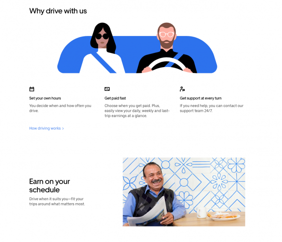
This is what Uber did when sharing its USP on this landing page.

Phrases like “set your own hours,” “get paid fast,” and “earn on your schedule” are just some of the words you’ll most likely hear from their buyer persona.
Another example that puts this tip into practice is from Locksmiths of Durham, where their USPs are outlined above the fold. It’s the first thing people see whenever the page loads, and it’s a great way to explain what the site is about.
6. Focus your copy on your customer
When your target audience search online, they’re looking to solve their problems — not someone else’s.
So, when they visit your landing page, and they read through the copy, the only question they want answered is, “what’s in it for me?”
That’s why you’ll need to have a well-crafted buyer persona or avatar. This will give you an insight into what are the things that are keeping your target audience up at night and the goals they want to achieve.
Your buyer persona will also give you an insight into what information they want to know, how they want it presented, and even in what order.
If you don’t have a buyer persona or avatar for your blog yet, you can quickly create one using an online buyer persona generator tool.
7. Match your opt-in forms with your offer
Landing page forms have one sole purpose: to help you collect your visitor’s contact details. Without this, you won’t be able to connect and build a relationship with your visitors, and eventually convince them to buy.
The mistake many bloggers and marketers make is including a form that asks a lot of information.
Your target audience is very protective of their contact details. They would only give out their details when they’re convinced that they get in exchange is worth divulging this information.
So if you want to increase your landing page’s conversion rates, you have to make sure that the value of what you’re offering should justify the amount of information you’re asking from your visitors.
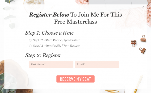
If you’re landing page is offering an ebook or a training video, asking for their name and their email address should suffice like this one in Amy Porterfield’s website.
On the other hand, if you’re offering a free product demonstration and you’re targeting B2B businesses, then it’s perfectly understandable to ask for more details like their job title and their phone number.
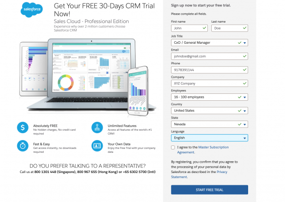
If you need a lot of details, make this less intimidating by auto-filling the long form with your lead’s contact details like this landing page from Salesforce.
Conclusion
Optimizing your landing page’s conversion rates is a relatively new, but very promising, strategy to get more customers and grow your business. That’s because it allows you to maximize the current traffic your website’s already receiving.
At the core of the seven different tips shared here is your target market. Things like search engine optimization can affect your conversion rates. However, in the end, it’s the people that visit your site—not Google—that will download your content offer, register for your webinar, or buy your products.
Get to know who’s your target market. Understand their pain points and dreams. Learn what words resonate most with them. These are what’s going to help you write an eye-catchy headline, a copy they can relate with, and a call-to-action that’ll get them to take action.
Above all, make the process easy for them. Have a clean and uncluttered landing page design and don’t scare them away with a lengthy and intimidating form.
The tips shared here aren’t a magic formula that’ll boost your conversion rates overnight. However, stay consistent with this, you’ll begin to notice a positive change in both your analytics and revenue.
Related posts:
5 Cognitive Biases You Can Use to Boost E-Commerce Conversions