How to Create Killer SEO Content on a Budget

Do you like a side serving of science with your SEO content tips? If so, Search Engine Land’s periodic table of SEO success factors makes for an interesting read. It’s not so much science, more SEO tips presented in a ‘sciencey’ kind of way, but it does tell you all you need to know about the importance of kick-ass content. As you can see, the very first element on this periodic table is quality content, which shows just what a huge impact it can have on your search engine rankings. In fact, creating good content is probably the most important off-page SEO factor there is.
[bctt tweet=”Creating good content is probably the most important off-page SEO factor there is.” username=”blogherald”]
But sadly, killer SEO content does not come for free. It has to be researched, designed, written, promoted and published, and all that takes time. And, to quote an age-old business adage, time, ladies and gentlemen, is money. In this article, we want to show you how creating shiny, high-grade content can be achieved without spending a fortune, so, if you can spare five minutes of your time, you might just learn something…
Data visualisation
Does your business have data? Yes? That’s brilliant.
Does your business have data that might be of some interest to your customers? Now we’re talking.
Data visualisation is one of the simplest content creation methods on the block. Data visualisation is simply presenting the data you have in a way that makes it accessible to the reader. Some data can be difficult to digest in written form and will not necessarily appeal to the tiny minds of the internet generation. But present that data in a visual context that helps people understand the patterns, trends and correlations that might otherwise go undetected and suddenly you have something of value.
Here’s a nice example of data visualisation in practice:
The data itself is not exactly earth-shattering but presented in this appealing way it is far more digestible than it might otherwise be. And there’s nothing here that you couldn’t easily do yourself. Whatever data you have, whether it’s the price of rental property in your surrounding area or the soil ph best suited to growing different vegetables, you could be in business. If you don’t have any data worth publishing, simply survey customers or visitors to your site to generate something worthwhile. You can then publish the data visualisation on your own website and promote it on social media. Alternatively, if your own blog doesn’t have much reach, contact an authority in your industry to see if they’d be interested in publishing it for you.
Infographics
They might not be the cheapest form of content marketing in the first instance, but pound-for-pound, infographics, done well, have the potential to deliver the most bang for your buck. Why? Well, because…
- An infographic is 30 times more likely to be read than a text-based article;
- Humans remember 80 percent of what they see and only 20 percent of what they read;
- 90 percent of information processed by the brain is visual
Source: Connexica
It is also worth noting that some agencies like Fusewave and others that work mainly with small to medium size clients, have strategies to create quality content without the need for a big budget.
5 Killer SEO Posts that You Can Apply on Your Blog This 2017
Both infographics and data visualisation are tools used to visually represent data. The real difference is that infographics tend to tell a story, leading you through numerous data sets in a logical way with a beginning, middle and end. Data visualisation, on the other hand, is commonly used to communicate a single, standalone set of data.
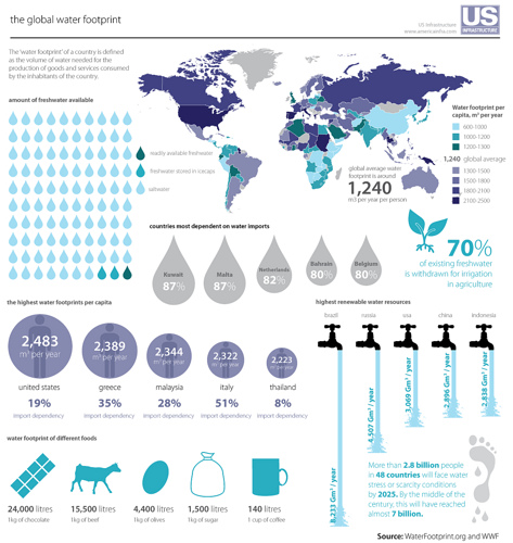
Here’s an example of a particularly relevant infographic in practice.
The key to producing an infographic that delivers in terms of SEO, i.e. attracts plenty of traffic and engagement, is the initial research. The story you tell must be insightful, original, accurate, relevant to your audience and interesting. To do that, you need data that has been collected, sorted, analysed and presented with your audience in mind.
Once you understand your data, it’s important to think carefully about the story you want to tell. You should focus on the main piece of data you want to present and add the supporting information required to tell the story. Only then can you think about how your infographic will look.
Not everyone has an eye or the skill for design, so you may need the help of a professional designer to create the maximum visual appeal. You should then consider where to publish and promote your infographic to generate the maximum impact.
Targeting keywords or phrases

Even with a design-led form of SEO content, it is essential you give it the very best chance of being found online. Yes, hopefully you will generate a good amount of views and engagement from the original publication, whether that’s on your own blog or a guest publication, and promoting the content on social media will help. However, you must also create content that answers a question your audience are actively asking.
Taking the above soil ph example, carrying out some keyword research will help you identify what terms around this topic your audience are searching for. For example, ‘the best soil for growing vegetables’ may be a searched for term with a relatively low level of competition. Alternatively, ‘how to grow vegetables’ will be more competitive but it may have the potential to introduce you and your business to more prospective customers. The days of keyword stuffing are long gone, but simply giving your content a searched for title tag will help to generate some additional traffic from the SERPs.
Author bio: Ashley Fleming is a writer, editor and marketer who is interested in the world of digital marketing and new ways businesses can effectively promote themselves. His marketing blogs can be found on the Fusewave website.


